Author Archives: JasonHunter Design

Go Behind The Scenes with JasonHunter Design

A lot of creative energy and technical skill go into each website built with JasonHunter Design. Every company we work with has unique ideas, requirements, and technology needs, and we work closely with them to achieve those goals.

It’s one thing to see the results of our work in an online portfolio. It’s a whole other thing to explain some of our creative reasoning! What’s going on behind the scenes? How do we decide to utilize this technical solution or select that layout?

To demonstrate, we’re offering a glimpse of our creative process to current and future clients. Keep reading to learn about the “why” behind three select websites JasonHunter Design launched in October 2018, and to see the final results of several other websites we launched this month.

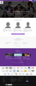
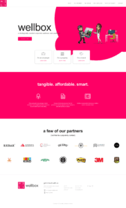
Wellbox
Corporate wellness programs are an $8 billion industry. Wellbox’s exciting take on the opportunity connects brands to entities who want to invest in the health of their employees, tenants or residents.

The Wellbox website speaks to several audiences, and we wanted to ensure that visitors knew exactly where to go for information. Is the visitor a brand looking to share products with a captive audience, an employer looking to bring the program to their company, or a property bringing a fun twist to health and wellness to visitors and tenants? The main menu and home page steer each visitor type to the content they need to act.

Wellbox was so pleased with the design – which includes Bitmojis! — that they recorded a video testimonial and sent it over to us! You can watch it here:

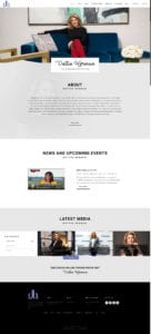
Dottie Herman
Dottie Herman is the richest self-made woman in real estate. Don’t take our word for it – Forbes gave her the title! Such an influential figure needed a website that showcased not only her story, but all the buzz surrounding her work, including media appearances, a forum to share her expertise with followers, and her podcast and radio show, Eye on Real Estate. We partnered closely with her brand manager, Laura Morton, to build a website which reflected Dottie’s success and personality. Dottie is thrilled with the results – and so are we.

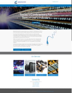
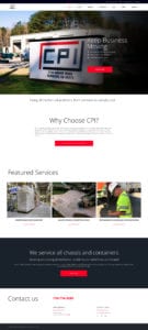
CPI Enterprises
Chassis repair isn’t exactly something we think about every day, but their proper maintenance is crucial for truck safety.

We wanted to highlight the company’s commitment to safety and compliance front and center, and the best way to do that was to depict the company beyond photos of truck parts and semis on the road. JasonHunter Design collaborated with a photographer who stopped by company headquarters in Fairburn, GA, to capture CPI Enterprises in action. The results are stunning: our photographer captured the diligent mechanical work the mechanics do every day, as well as glimpses behind the scenes of the warehouse, corporate offices and repair areas.

Bringing ideas to life with JasonHunter Design
Three websites, three totally different audiences, three completely different goals.

All three of this month’s featured websites showcase how design, photos, copy, and more all work hand-in-hand to communicate brand message. For Wellbox, design was driven by a desire to get the right information in front of each unique visitor type. Dottie Herman’s site is a platform which showcases her expertise and a platform to connect with followers. CPI used photography to demonstrate their commitment to truck chassis compliance, safety and repair.

By the way, Wellbox, Dottie Herman and CPI Enterprises are just three of the 12 websites JasonHunter Design launched so far this month. You can see all the websites we created by visiting our portfolio.

Inspired by what you see? Have an idea of your own? Contact JasonHunter Design and reserve your free initial consultation!

JasonHunter Design CEO Returns To The Classroom with Community for Creativity

Recently, Jason Hunter Design CEO Jason Bass teamed up with Community for Creativity, an Fayette County-based initiative which connects students with leaders of Georgia’s $29 billion creative economy. In this blog, Jason dives into his recent experience teaching branding to middle schoolers at Rising Starr Middle School in Fayetteville– and what he learned from them in turn.

I immediately jumped at the chance when I was asked to share insight on branding with middle schoolers at Rising Starr Middle School in Fayetteville.

The branding crash course was put together by Community for Creativity, a 2018-2019 program the Fayette County Public Schools designed to introduce students to careers in creative professions, such as design, the arts, and yes, web design! I spent a few hours with a few dozen students at Rising Starr Middle School, where I presented branding basics to four middle school classes.

My presentation started off quizzing them on some well-known logos to drive home the point that a logo is a symbol used to identify something or someone. I showed them hidden symbolism in some famous logos, such as the forward-facing arrow in the FedEx logo or the arrow pointing from A to Z in the Amazon logo. (Their minds were blown!)

From there, we did an exercise where students wrote down three words they would use to describe themselves, and three more words they thought others would use the describe them. Once they had their lists, I showed them a color chart and explained some of the psychology behind color choice. The students then selected the color they felt best represented them.

Using their selected words and colors, the students were asked to draw 10 logos that they felt represented themselves. Once they reached the 10th, they could then go back and choose a few to explore further. Not only was I amazed at some of the words they chose, but the sketches were impressive, too.

We squeezed a lot into a 45-minute session, and while nobody completed their own brand in such a short amount of time, the students got a first-hand look into just how difficult it can be to build a brand.

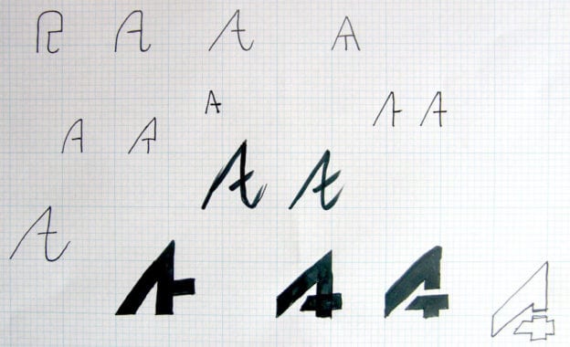
As they were wrapping up, I showed them the process I went through coming up with the logo for Jason Hunter Design, and then unveiled the logo for Community for Creativity program.

I wanted the students to make the clear connection between symbolism, color, and brand name. With these lessons fresh in their minds, I asked for their opinions on the Community for Creativity logo.

For instance, one student said that he felt each line that made up the shape could represent a different culture, and pointed out that they all intertwined, like they would in a community. Another pointed out that the shape looked like a bending infinity symbol, like how a community always adapts to work together. I was absolutely amazed with how quickly the lessons took root.

Spending time in the classroom with Community for Creativity reminded me how much I love educating the next generation. Before I started Jason Hunter Design, I taught art to high schoolers in New Jersey, where I absolutely loved that “a-ha” moment in a student’s eyes when a lesson stuck. Seeing the students at Rising Starr Middle School have their “a-ha” moment was a wonderful reminder of the power of knowledge, education, and opportunity to learn.

We can all learn something from the youth shaping our future. Their fresh look on a new subject, and their eagerness to tackle its challenges head-on, should be a reminder for all of us that education doesn’t stop at the classroom. These students inspired me to expand my own knowledge and tackle something new. Best of all, it was a reminder that the future of Fayette County, and Georgia as a whole, is in excellent hands!

The Importance of Branding for Nonprofits

Nonprofits are designed to achieve a specific objective. They are also in direct competition with other charities for the time, money and goodwill of potential supporters. Branding serves a number of purposes that help nonprofits make an impact, including a clear definition of your distinct advantage. Use your website to promote your brand in order to raise the profile of your mission.

Benefits of Developing Your Nonprofit Brand

Branding is traditionally associated with commercial businesses, but it can be even more important for nonprofits. While businesses exchange a good or service for money, nonprofits rely on donors to give out of a sense of compassion for the mission. Branding conveys that mission in a few words, a logo and color scheme that attracts money and committed people who want to give time to volunteer.

Promote Your Mission Through Your Website

Your website lets you delve a bit deeper into the story of your nonprofit, but some general tips can help you do this well. Develop on a user-friendly design that makes your site pleasant to browse, while being informative and true to your core mission.

  • The look: Branded design, professional photos, call to action buttons are all part of an easy-to-read and attractive layout. Strong and mobile-friendly design shows visitors you care about your mission and the details of your story.
  • The message: Potential donors and volunteers want to understand your mission. They also need to see how you make a difference. Clearly state the problem you solve and how your activities make an impact.
  • The experience: An interactive website helps you engage with a potential stakeholder, but they should leave your site feeling empowered. Too many clicks can lead to frustration and confusion. Streamline the experience and get to the point.

As a nonprofit, you benefit from the opportunity to connect with a mindful consumer. Younger generations are more conscious of their place in the world than any generations before. Through the right website, you can attract this important segment of advocates and supporters.

Your brand is the cornerstone of how you present your nonprofit to the world and can be a key driver in its success. Your website is your tool to promote the brand your organization’s mission.